The Power of Cropping

Any half decent editing software will have competent cropping tools that can be customised with features such as the Rule of Thirds grid.
A month ago, I did my first wind-back blog where I looked at my photos from a trip to Iceland in 2016. One of the areas I said needed to improve upon were my weak panoramics, where I was capturing huge views of empty or boring space. Well, I revisited them again this week after I watched a video tutorial on composition by landscape photographer Gavin Hardcastle. In this he explained the importance of experimenting with the cropping tool in Lightroom/Photoshop on photos you have previously taken to learn more about composition before you next head out into the field. It was a fascinating experience playing around and creating entirely new images or perspectives with photos I had looked at many times over several years. I will take you through several examples below.

The original bridge photo in 3:2 aspect ratio. The bright highlight in the top left corner distracts the viewer from the intended subject.
First, we will look at my favourite image from Iceland which is the shot of the broken bridge (in the aspect ratio of 3:2, the same as my camera sensor). The bridge is the main focal point of the image, but it is completing for attention with the mountain in the background and this is made worse by the bright highlights of the snow. Remember that a viewer’s eye will also be drawn to the brightest parts of your image, so having a spot like this in the background (or foreground) will pull focus away from your subject and weaken your image. Let us try a couple of different crops and see what difference that makes.

Square (1:1) crop. The main subject is still in shot but there is nowhere for the viewers eye to travel through the photo and the distracting highlight remains.
This next one is a square crop (1:1 aspect ratio) and straight away we can see that this is a less impactful image than the original. The bridge is now taking up more of the shot but by cropping in at this ratio we left in the bright top of the mountain and awkwardly cut out the building on the other side. The viewers eye no longer has anywhere to go as the bridge no longer leads anywhere.

16:9 crop. The horizontal thrust emphasizes the shape and direction of the bridge and has removed the distracting bright highlight.
In contrast this image is cropped in a 16:9 aspect ratio (the same as cinema) and this is the best of the three. The bright distraction in the background has now been removed and there is a greater emphasis on a horizontal thrust which pushes the viewers eye across the bridge and over to the other side. Now this has not suddenly transformed this image into a great one, but it goes to show images can be improved simply by cropping and changing perspective.
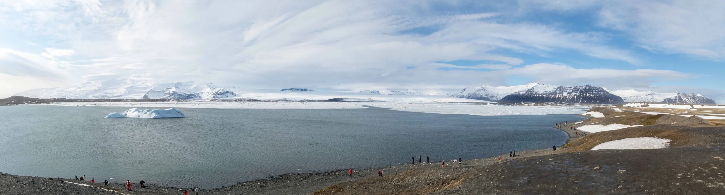
The Ice Lagoon panorama. Just look at all that empty space!
Next up we will look at the panoramic I took at the Ice Lagoon. In my previous blog I stated that it is a bad image: unbalanced and full of empty, boring space. However, by getting the cropping tool out individual images of interest can be identified within the larger one. Just from a glance you can see that there is not that much ice in shot with the notable exception of a single iceberg.

Cropping in on the lone Iceberg with a 16:9 aspect ratio. We now have a clear intended subject but there is little else for the viewer to chew on.
For my first crop I have gone for a 16:9 highlighting the iceberg as well as the interesting mountain scenery behind. There is a lot of dimension in that background that you simply would not have seen when looking at the entire panoramic and thankfully there is just a little bit of separation between the background and foreground elements. Though this image is still not a particularly strong one as the brightest top left corner still fights for dominance over the iceberg. Taller crops simply would not work here as you will take on more empty space of either the water or the sky that do not add anything.

The most interesting image from the panoramic. The viewer has a subject and somewhere for their eye to follow through the frame and using a square (1:1) crop has eliminated most of the empty space.
For my final crop I have gone to the other side of the panorama and opted for another square (1:1) crop. By using this aspect ratio we still have the full perspective of the people on the shoreline that winds from one side of the image to another, leading to the mountain, but we have eliminated the dead space that sat on either side. There is not a single bright highlight that overwhelms the eye and the bright red coats of some of the tourists help draw the viewers attention to the part of the image I want them to focus on, which is the shore. Again, it is not a shot that will end up in my portfolio, but it is certainly a more interesting photo than the original panoramic.
So, there you have it. It is something so simple that can be done from the comfort of home, yet it never occurred to me to try it out. Working through this exercise has made me think a lot more about how I compose images and why it is so critically important to identify a strong subject and frame your image around supporting that focal point. If you struggle to find individual images within a panoramic than it is not very surprising, why the larger image is so weak. No one wants to look at dead space without a subject. Strong composition is a factor that will never change regardless of what you are shooting and what gear you use, get this right and you will have a much more enjoyable time with your camera. Think more, shoot less, but shoot smarter.
Have you been experimenting with the cropping tool on your old photos? Let me know how you have been getting on in the comments below.
I purchased the composition tutorial through this year’s Photography 5-day deal. Once a year in October many digital tutorials and resources from top photographers are offered at a massive discount to raise money for charity.
You can check out the website here: https://5daydeal.com/
Gavin Hardcastle’s website and the tutorials can be found directly here: https://www.fototripper.com/store/category/online-photography-courses/
If you enjoyed this blog then please consider leaving a tip below.